Where Script Meets Surface
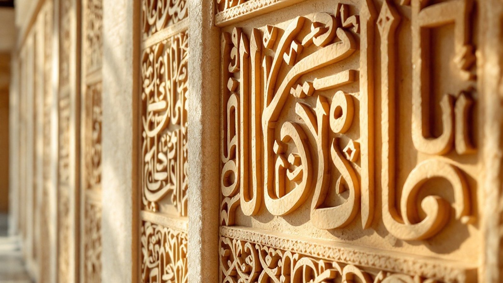
Walk slowly around Hukuru Miskiy, Malé's Old Friday Mosque built in 1656, and you will find Thaana doing something script rarely does: holding up a building's beauty. Bands of carved coral-stone calligraphy run across interior panels and tombstones, the right-to-left letters flowing in tight, deliberate rows. The craftsmen who worked this reef limestone treated the script not as labelling but as ornament — each letterform a small architectural event. The mosque is a UNESCO-recognised monument, and its carved inscriptions remain among the finest examples of decorative Thaana anywhere in the archipelago.
Manuscripts from the Islamic Sultanate period show a parallel tradition in ink. Court scribes produced Quran copies and royal decrees in which the vowel diacritics — the small marks floating above and below each consonant — were given as much care as the letters themselves. Spacing, weight and the subtle calligraphic angle of each stroke varied between hands, making individual scribes identifiable across documents held today at the National Museum of the Maldives. Unlike Arabic calligraphy, which had centuries of formalised schools and named styles, Thaana calligraphy developed in relative isolation, producing a quieter visual character: more linear, less dramatically swooping, but precise in its own register.
That restraint suits the material. Coral stone rewards clean lines rather than flourish, and the best carved inscriptions on tombs at Isdhoo and at sites across Laamu Atoll show how Maldivian craftsmen understood this intuitively. Letters are carved at consistent depth, their curves smooth rather than angular, the overall effect disciplined without being stiff.
Contemporary artists and craftspeople are returning to this heritage with fresh eyes. Thaana lettering appears on printed textiles, lacquerware — the tradition known as laajehun — and in hand-painted signage that rejects the default Latin alphabet in favour of something unmistakably local. Graphic designers working in Malé have begun exploring Thaana's inherent geometry, building compositions from its RTL rhythm and the visual interplay between consonant bodies and their diacritics.
The script was designed to be read. But from the coral panels of Hukuru Miskiy to a piece of lacquerwork in a craftsperson's workshop, it has always also been designed to be seen.